Real-Time Solar Panel Monitoring via Bluetooth
A native Android app delivering live performance insights with custom-built visualizations and fluid animations — all powered by Jetpack Compose.
Project Overview
Designed and shipped a high-fidelity monitoring application for solar installations that connects directly to hardware via Bluetooth. The focus was on turning raw telemetry into clear, actionable insights while creating an interface that feels responsive and delightful to use — even when handling continuous live data streams.
Technical Overview
A modern Android stack built entirely with Jetpack Compose and Kotlin — prioritizing performance, maintainability, and visual polish.
- UI Layer: Jetpack Compose, custom Canvas drawings, Lottie for micro-interactions
- Architecture: Clean Architecture + MVVM, StateFlow/SharedFlow, single source of truth
- Dependency Injection: Hilt
- Async & Reactive: Kotlin Coroutines, Flow, Channel buffering for BLE packets
- Bluetooth: Android BLE API with notification characteristics and robust reconnection
- Persistence: Room for session caching and offline charts
- Animations: Compose Animation API, spring physics, custom Path interpolators
- Testing: Unit tests for repository and view-model layers, UI tests for critical flows
- Build & Delivery: Gradle Kotlin DSL, version catalog, signed release builds
Visual Showcase
Custom animated antenna icon and a polished waiting screen visualize the search and pairing process, making the wait for device connection clear and engaging.
Showcasing how much the content animated base on their state, for example, when the list item value changes, it changes super smoothly from a totally different component to a text and also, the text isn't static and it's changes dynamic and each digit gets animate independently.
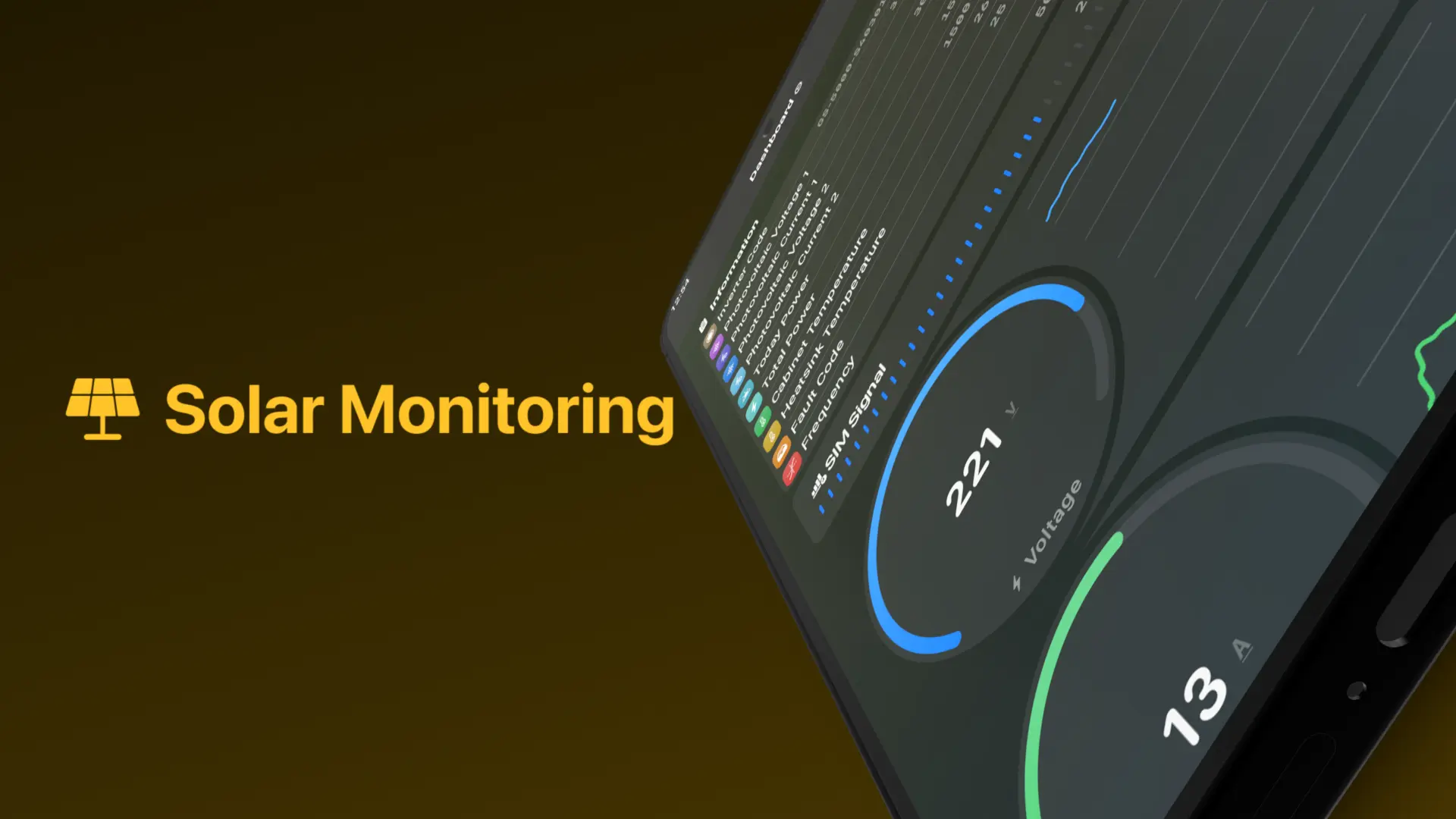
The data that came from the bluethooth is getting visualized base on the data type, for example, some data are showing in the information list and some data are showing in the charts and gauges. the gauges made from scratch with jetpack compose canvas. I'll publish the gauges as a separate open-source library soon.
Another visualizer for this project is charts, i made them too to make super immersive and efficient animation. As you can see, the thread line of the chart moves on super smoothly when its data changes.
The Challenge
The client needed a reliable way to visualize live solar data on-site without relying on cloud dashboards. The hardware sent frequent Bluetooth updates, so the app had to feel instantaneous while remaining battery-friendly and resilient to connection drops.
- Real-time fidelity: Show accurate, smooth updates without jank even at high packet rates.
- Battery consciousness: Avoid excessive CPU/GPU usage despite continuous animations and charting.
- Connection resilience: Graceful handling of BLE disconnects and reconnections without losing context.
- Data clarity: Present technical telemetry (voltage, current, temperature, yield) in a way installers and owners can understand at a glance.
- No third-party charting libraries: Everything custom-built to control performance and appearance precisely.
- Single codebase maintainability: Clean architecture that scales if more device types are added later.
Approach & Key Decisions
I chose a fully custom Compose implementation to own every pixel and frame. The goal was to make the app feel alive when data flows and calm when idle — using motion intentionally to reinforce information hierarchy.
Architecture & Data Flow
Built on Clean Architecture with MVVM. Bluetooth handling lives in a dedicated repository layer using Kotlin Flows for reactive, cancellable streams.
- Separated BLE connection logic from UI to survive configuration changes and process death
- Used shared flows with replay cache to recover recent data after reconnect
- StateFlow for UI state — single source of truth, easy to test and reason about
- Hilt for dependency injection — kept modules scoped and replaceable
Real-Time Visualizations
All charts and gauges drawn manually on Canvas — giving full control over interpolation, performance, and visual style.
- Custom Path-based line charts with cubic bezier smoothing and dynamic window scrolling
- Radial gauges using arc sweeps and animated value changes with spring physics
- Sparse sampling for historical data to keep draw calls minimal
- Off-main-thread preprocessing of incoming packets before emitting to UI
Animation Philosophy
Motion used sparingly and purposefully — always tied to data changes or user interaction.
- Staggered entrance animations on launch to establish visual hierarchy
- Spring-based value animations for metrics (fast settle, natural feel)
- Shared element transitions when drilling into details
- Subtle breathing pulse on connection status to indicate health without distraction
Performance & Battery
Prioritized efficiency from day one — targeting 60 fps on mid-range devices while connected.
- Limited Canvas redraws to dirty regions only
- Throttled UI updates when values change minimally
- Background service with foreground notification only when actively monitoring
- Efficient BLE characteristic reading (notification mode, no polling)
Resilience & UX
Designed for the real-world environment of rooftops and inverters — where connections drop and devices reboot.
- Auto-reconnect with exponential backoff and user-visible status
- Persisted recent sessions locally (Room) for offline review
- Clear, non-technical messaging for connection states and errors
- One-tap refresh and manual scan fallback
Results & Impact
From hardware reading to screen update — consistently sub-second even during peak packet rates.
Optimized drawing and BLE usage resulted in minimal drain during active monitoring.
App seamlessly resumes data flow after temporary disconnects without user intervention.
Reflection
This project was a reminder of how much impact thoughtful motion and custom drawing can have in technical tools. When data arrives continuously, animation isn’t decoration — it becomes a primary way to communicate change and system health. By owning the rendering pipeline completely, I could make the app feel truly alive while staying performant and reliable in real field conditions.
Key Takeaways
- Custom beats off-the-shelf: When performance and feel matter, building your own charts pays off.
- Motion with meaning: The best animations are the ones users don’t notice — until they’re gone.
- BLE is fragile: Resilience and clear feedback turn a flaky connection into a trustworthy tool.
- Compose shines for data-heavy UIs: The declarative model makes complex, reactive screens far easier to reason about.
- Constraints breed creativity: Working within battery, CPU, and bandwidth limits forced decisions that ultimately improved the product.
Related Case Studies

Tomorrow's Cuisine App
A Recipe & Social Network App for Food Lovers
A mobile app that provides recipes based on available ingredients, and its provide a social network for food lovers to share their recipes and cooking experiences and get feedbacks.

Call Blaze App
Automated Call Answering with Custom Audio Playback
A root-enabled Android app that auto-answers calls and plays selected audio directly into the voice stream — built for specialized communication scenarios.